Interested in this project?
Continue LearningGetting Started
As with all our web development projects, we’ll need three files:
- index.html - for our HTML markup
- style.css - for styling the clock
- app.js - for the clock function(s)
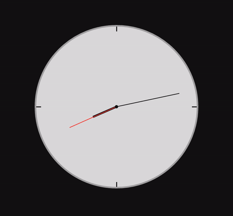
As seen above, our clock has many different elements that make it well, a clock. No, we aren’t using any old image. Instead, we’ll be using CSS to handcraft this clock ourselves. If you count up all the different elements in the clock, you will notice that we need nine different div elements for the following:
- clock - the clock circle
- hours - hour hand
- minutes - minute hand
- seconds - seconds hand
- center - the center dot
- three - indicator for third hour
- six - indicator for sixth hour
- nine - indicator for ninth hour
- twelve - indicator for twelfth hour
Let's setup our index.html file with our page title
Let’s create those divs in our index.html file:
<html>
  <head>
    <title>Clock</title>
    <meta name="viewport" content="width=device-width, initial-scale=1" />
    <link rel="stylesheet" href="style.css" />
  </head>

  <body>
    <div class="clock">
      <div id="hours"></div>
      <div id="minutes"></div>
      <div id="seconds"></div>
      <div class="three"></div>
      <div class="six"></div>
      <div class="nine"></div>
      <div class="twelve"></div>
      <div class="center"></div>
    </div>

    <script type="text/javascript" src="app.js"></script>
  </body>
</html>
Notice how we set ids for the hours, minutes, and seconds arms so that when we actually want to make them move, it'll be easier to communicate with them in JavaScript.
Designing the Clock
Here comes the hard part. We have to actually design the clock with nothing but CSS. First, we have to set our background color to black (hex code #000) and make the circular shape of the clock. We can do that by starting with a height and width of the clock class to be 500px, and the border-radius to 100% so that we can make it circular. We also need a border with a greyish (hex code #aaaaaa) color, and to make the clock centered on the page, we can set the margin to auto and absolutely position the clock to the center. A great CSS reference to better understand some of these properties is this site. You can look up each property and see what they mean there!
* {
  margin: 0;
  padding: 0;
  border: 0;
}

body {
  background-color: #000;
}

.clock {
  height: 500px;
  width: 500px;
  background-color: #dddddd;
  border-radius: 100%;
  border: 3px solid #aaaaaa;
  margin: auto;
  position: absolute;
  top: 0;
  left: 0;
  bottom: 0;
  right: 0;
}
Now that we've got this big circle on our screen, we need to make the small indicators for the third, sixth, ninth, and twelfth hours. We can do this by making all four of those divs have a width of 3px, a length of 15px, a color of #000 (black), and playing around with the position (top, bottom, left, right) attributes:
.twelve {
  position: absolute;
  width: 3px;
  height: 15px;
  background: #111111;
  left: 0;
  top: 0;
  right: 0;
  margin: 0 auto;
}

.three {
  position: absolute;
  width: 15px;
  height: 3px;
  background: #111111;
  top: 0;
  bottom: 0;
  right: 0;
  margin: auto 0;
}

.six {
  position: absolute;
  width: 3px;
  height: 15px;
  background: #111111;
  left: 0;
  bottom: 0;
  right: 0;
  margin: 0 auto;
}

.nine {
  position: absolute;
  width: 15px;
  height: 3px;
  background: #111111;
  top: 0;
  bottom: 0;
  left: 0;
  margin: auto 0;
}
Alright, now we've got a better looking clock. However, it isn't quite done yet! We still need to design the hour, minute, and second arms!
This is where it gets a little more complex as all of these arms have different lengths and widths. Before that, however, we just need a small dot in the center that 10px by 10px.
For the second hand, let's set a height of 160px, a width of 2px, and a #ff4136 (red) color. For the minute hand, we can set a height of 200px, and a width of 2px, and a #000 (black) color. Lastly, for the hour hand, we can set a height of 80px, a width of 6px, and a #000 (black) color.
For all of the hands we also need to set a -webkit-transform-origin so that the element can move it's position once we link it with our JavaScript. And lastly, we need to play around with the abolsute positioning to make the hands sit on the center dot perfectly. Notice how we set the number of pixels from the bottom of the clock for the seconds, minute, and hour hands is equal to their respective heights.
.center {
  width: 10px;
  height: 10px;
  position: absolute;
  left: 0;
  right: 0;
  bottom: 0;
  top: 0;
  margin: auto;
  background: #000;
  border-radius: 100%;
}

#seconds {
  position: absolute;
  height: 160px;
  width: 2px;
  left: 0;
  right: 0;
  bottom: 160px;
  top: 0px;
  margin: auto;
  background: #000;
  -webkit-transform-origin: bottom;
  background: #ff4136;
}

#minutes {
  position: absolute;
  height: 200px;
  width: 2px;
  left: 0;
  right: 0;
  bottom: 200px;
  top: 0px;
  margin: auto;
  background: #000;
  -webkit-transform-origin: bottom;
}

#hours {
  position: absolute;
  height: 80px;
  width: 6px;
  left: 0;
  right: 0;
  bottom: 80px;
  top: 0px;
  margin: auto;
  background: #000;
  -webkit-transform-origin: bottom;
}
We now have a good-looking clock, but it doesn't move it's hands! Let's change that with some JavaScript.
Making the Clock Work
To make our hands actually move, we have to write a function in JavaScript. Since every circle is 360 degrees, and there are 12 hours, after each hour, the hour hand will move 30 degrees. Similarly, since there are 60 minutes in an hour, and 60 seconds in a minute, the minute and second hands will both move 6 degrees every minute or second. So, all we have to do, is make those element id's rotate those degrees using the -webkit-transform:rotate attribute. Here's what our JavaScript function should look like:
function moveHands() {
  with (new Date()) {
    h = 30 * ((getHours() % 12) + getMinutes() / 60); // 30 degrees hour
    m = 6 * getMinutes(); // 6 degrees every minute
    s = 6 * getSeconds(); // 6 degrees every second
    // setting the rotate CSS attribute to those degree values -->
    document.getElementById("seconds").style.cssText =
      "-webkit-transform:rotate(" + s + "deg);";
    document.getElementById("minutes").style.cssText =
      "-webkit-transform:rotate(" + m + "deg);";
    document.getElementById("hours").style.cssText =
      "-webkit-transform:rotate(" + h + "deg);";

    setTimeout(moveHands, 1000); // calling the function every second
  }
}

window.onload = moveHands; // making sure the function starts on load of webpage
You did it! We now have a fully-functional, minimal, and beautiful clock. I hope you've learned a ton in terms of CSS design and JavaScript's functionality in these types of projects.
What's next?
Don't stop! Maybe make the time display digitally underneath it, customize the look of the clock to your style, or even better - try and make the clock responsive with media queries!
Comments (0)